
A few weeks ago, during a little break from studies, I’ve finally found some time for installing Plasma 5 on my Arch Linux workstation. Before a not too deep period of usage I’d like to share with you my impressions on the current state of Plasma.
As the title says, I’m going to talk about the 5.2 version of Plasma so everything on this post will concern this version in particular.
If you’re a Linux user at least from 2007 and, above all, you were using Kde at time, you will surely remember how had been stressful the passage to Kde 4.
This was mainly due to the choose of some of the most important Linux distributions as Fedora, to adopt this desktop environment even if it was not still ready to use.
Kde 4.0 in fact was released clearly incomplete and far to be stable.
In my opinion, this choose was made and justified, because the transition to a more modern and complex desktop environment that implies some of the most – at time – innovative technologies, needed not only a lot of work to be completed but also a long time of testing by actual users making nearly impossible the release of a full and stable desktop environment from the beginning.
As many will remember, Kde 4, up to the 4.8 version, continued not only to be refined, but developers continued to add and remove relevant features in order to make Kde increasingly more complete and functionally.
Plasma 5 instead aims making the passage to a new generation of desktop environment the most gradual and quiet possible also thanks to the fact that probably in this current mobile oriented epoch, the world of desktop user interaction doesn’t need big revolutions.
So, Plasma 5 propose itself as a modern continuation without too many great upsettings of what Kde 4 has done in recent years.
Let’s take a look on Plasma 5.
The look
At first glance Plasma 5.2 with it’s brand new Breeze style, appears definitely pleasant to the eye and modern thanks to it’s minimalism delegated to the fashionable flat style used in the most recent design works.
The Breeze style makes blurs and clear backgrounds, with dark texts or icons, it’s piece de resistance allowing the best readability for the user.
The default icon theme it’s a color explosion: icons are flat, bi-chromatic and with vivid background colors, a bit as it happens with the Android Material Design.
However I think that icons may need to be improved a little because, at first glance, users may be unable to understand to which file format is associated an icon. Symbols inside icons, in my opinion, don’t stand out from the background so I guess this may cause problems to some users in identifying quickly a file format.
In addition to that, icons on tool-bars, always according to me, are too sketched though I think they will be improved on future versions of Plasma.
Usability
Plasma 5, at least for the moment, doesn’t bring anything revolutionary from the usability perspective but aims to improve and optimize what has been done with Kde 4.
Plasma heavily uses Qt Quick making the entire environment not only aesthetically endearing but also more functional.
Plasmoids on system tray are stunning, functional and well designed. Compared to Kde 4 all appear more defined, modern and well ordered.
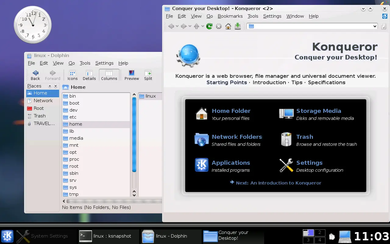
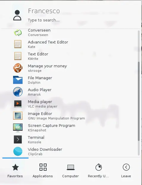
The Application Launcher is one of the best things of Plasma 5: responsive, beautiful and immediate.
Awesome features
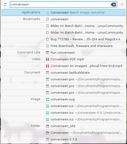
One of the most interesting things of Plasma 5 is KRunner. This new version allows the user to execute and find files on file system at a frightening speed!
Immediacy of search results is concretized to the smart way these are shown to the user. Search results are grouped by type and location and the search integration with browser bookmarks is noteworthy.
In Plasma 5 the plasmoid chooser is positioned on the letf side of the screen, making the selection of the desired plasmoid more immediate. The same for the activity bar.
Desktop Settings have been improved as well. Through the settings dialog it’s possible to link specific functions with the mouse buttons. We can assign a directory as desktop view, linking an activity to this as well and making the whole environment more dynamic.
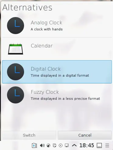
A nice brand new feature is the possibility of Plasma to suggest to user a possible alternative Plasmoid to an active one.
Unfortunately I think this feature will not be used so much because the development of new Plasmoids seems to not to attract too many people.
In conclusion
Ultimately, Plasma 5 is fully usable even if it remembers a bit the early development state of Kde 4, when all was fully operative but lacked the finishing work.
The environment is enough stable to be used in everyday work although some graphical bugs persist.
It isn’t uncommon to see artifacts, sometimes so serious to force the user to restart the Plasma session. Tooltips on system tray currently seems to suffer of design problems. For example they tend to disappear to fast or to remain stuck between application windows.
In any case, the journey of Plasma 5 has just started and certainly in the near future we’ll assist to something very interesting, mostly when the porting of Kde Applications to Qt5 and Kde Frameworks 5 will be completed, making the whole environment more homogeneous.
For fixing some graphical incongruences between Qt5 and Qt4 apps, I suggest to install the Breeze theme for Kde 4 and set it correctly using the qtconfig tool.
Maybe I might have forgotten to talk about something essential or interesting, so, if you have something to add you’re welcome to comment this post.
Comments are closed.